
The ABS estimates that only about 45 per cent of Australia’s firms are “innovation active”. These are the firms that tick “yes” when asked did were they innovative in the Business Characteristics Survey.
“During the year ended 30 June, 2015, did this business introduce any new or significantly improved goods or services?” (BCS 2014-15 survey form)
Its not a perfectmeasure by any means. The measure for instance, doesn’t tell us anything about the quality of regulation for example. The word “significantly” seems open for interpretation. And the person that actually fills in the survey may be well removed from businesses practices.
But it’s what we’ve got to work with.
Across the OECD, the 45 per cent figure doesn’t’ fare too bad. For SMEs, we are the fifth most innovative; for larger firms we are 14th.
45 per cent is an average figure, and as always, individual results can and do vary. If we dive deeper into the data, we find that some industries are much more innovative than others. Manufacturing, healthcare, arts and wholesale trade for instance are our most innovative sectors, while transport, construction and agriculture, are the least. Also, large businesses are much more likely to be innovation active than small businesses.
Drilling further still, we find that the firms most likely to innovative are those that employ 200 or more in real estate (91.1 per cent are innovation active), agriculture (90.6 per cent) and arts and recreation (90.2).
There are of course, not very many firms of that size in those sectors. These three total sum to be less than 0.1 per cent of all firms. (Actually, there could be way less than this, as the ABS don’t provide enough decimals to say for sure.)
At the other end, Australia’s least innovative firms are those that employ 1-4 workers in transport (11.0), 1-4 workers in agriculture (28.9), 5-19 workers in agriculture (29.5) or 0-4 in real estate (31.0). And here there are thousands of firms — 95 thousand in these four sub-sectors alone.
We can see this distribution of innovation in the chart below. Each column represents firms of a certain size within an industry. For example, the roughly 90 thousand firms in the big green block in the middle, are those Professional, Scientific and Technical Services firms that employ 1-4 workers. The big blue block on the right includes the 90 thousand construction firms that employ 1-4 workers. (Labels should appear when you hover over the chart). And the black line running through the middle is the average.
Innovation active firms by industry and firm size, 2013-14
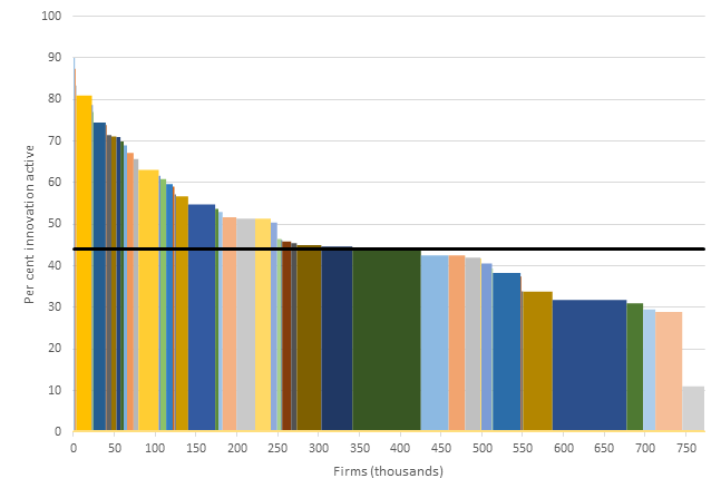
Notes: Non-employing firms are excluded from the data.
Source: Me, based on ABS BCS data.
Every column below the line, except one, represents a small firm that employs than four workers. Something like 60 per cent of our firms fit into this category. (Many more if we included non-employing firms.)
Understanding the distribution of innovative firms helps us to think about how to construct innovation policy, and the parts of the economy that innovation policy should target. The chart below shows the relative impact on the “innovation rate” from a one per cent increase in the number of innovative firms in each sub sector. The greatest impact would be caused by an improvement in the innovativeness of small (1-4 workers) Professional, Scientific and Technical Services firms. The next greatest impact comes from small Construction firms. Lesser gains are drawn from improving the performance of larger firms, however than are some such as those that employ 5-19 workers in Health Care sector that would make a significant impact as well.
Relative impact of a 1 per cent increase in the number of innovation active firms by industry and firm size

Source: Me, based on ABS BCS data.
Being very cautious of rate-seeking, the point here is of course not to improve the innovation rate. Innovation is a means, not an ends. The ultimate goal is an improvement in living standards, to which innovation can play a part. And furthermore, there is a danger of making policy based on data that is inherently information-poor. That said, an analysis like this does shed some light on where to start looking if we want to move the needle.
Post script: It took me a little while to figure out how to make a chart with variable column widths. It’s quite a bit fiddly. I probably could have just asked someone to help, but I found this website pretty helpful.
Also, the Grattan Institute’s latest podcast (featuring Charlie Day) is a must listen: How is technology reshaping the economy?

Leave a comment